Visual identity standards
Brand Guide
Welcome to your new daily ritual.
September 2026
Prepared by The Tribe Maker
mike@thetribemaker.com
Logo files are linked from this guide, one file at a time. There is no combined asset pack.
Each logo file has its own download in the logo section. There is no combined asset pack.
Section 01
The Juice Bar wordmark is a hand-lettered script: a small “the,” a large looping “Juice” and a small “bar.” The black file sits on light grounds. The white file sits on Ink and dark photography. The green file is for large brand moments on white. These are the PNG files published on thejuicebardallas.com today, trimmed of empty space. We did not find vector (SVG, AI or EPS) files on the live site; please send them if you have them.
Download each PNG from its card. There is no combined asset pack.
Files: img/logo/juicebar-logo-black.png, img/logo/juicebar-logo-white.png, img/logo/juicebar-logo-green-square.png, img/logo/juicebar-logo-green.png, img/logo/juicebar-map-pin.png, img/icon-512.png. Each file is linked on the guide page. There is no combined asset pack.

On Paper — primary black
On Ink — reversed white

Keep clear space equal to the height of the small “bar” on every side (about 20px at header size). The dashed box shows that margin.
Minimum display width is 96px. Shown here at that size. Below it the small “the” and “bar” fill in. For anything smaller, use the cup favicon.
Black on light. White on dark. Green on white, large. The map pin is for maps only. The favicon was built for this prototype from the cup in your map pin.


Section 02
The color comes from the juice. The rooms stay quiet and rich (Night, Forest, Cream, White) so the bottles, fruit and greens carry the page. Juice Green is taken from the logo and is the one brand accent. Night, Forest, Cream and Sand were added in the v2 design pass as room colors; they sit behind the brand, they do not replace it.
Green is jewelry. Juice Green marks the one action you want taken, the thin dash before a section label, and small highlights. It is never a full-page field. Put Ink text on Juice Green, not white: white on green fails contrast.
Night
#0B0F0D
Near-black room with a green undertone. Header, footer, menu and photo-led rooms. Carries a 5% grain.
19.3:1 with White text
Forest
#0F2A20
Deep green room. Process, cleanse benefits, FAQ. Alternates with Night so dark rooms never repeat.
15.3:1 with White text
Cream
#F4EFE6
Warm light room and page ground. Product photos on white melt into it with multiply.
Ground
Sand
#E4DBCB
Hairlines and quiet fills on Cream.
Decorative only
Juice Green
#2DB989
The logo green. Primary buttons, accents, the dash before a kicker. Ink text on it, never white.
6.4:1 with Ink text
Leaf
#48B86C
The current site accent. Hover glow and small highlights on Ink.
Use on Ink only for text
Leaf Deep
#2E7A47
Links and small labels on white.
5.3:1 on White
Ink
#222222
Headlines and body text on light rooms.
15.9:1 on White
Slate
#666666
Secondary text, captions, metadata.
5.7:1 on White
Paper
#FAFAFA
Quiet ground for documents and tables.
Ground
Mist
#EEEEEE
Hairlines, tiles, quiet fills.
Ground
White
#FFFFFF
Menu and product rooms. Bottle photography sits on white.
Ground
Stone
#C7C7C7
Borders on dark, disabled states.
Decorative only
Section 03
Two families. Fraunces, an editorial serif, carries headlines, big numbers and prices with confidence; a single italic phrase adds the voice. Raleway, the typeface on the current site, carries body text, navigation and labels. Labels run small, wide and uppercase; body text is set large and easy to read at 1.25rem / 1.6.
Fraunces — display
Made fresh daily.
Two tons of hydraulic pressure.
$11.50 16oz 2012
Raleway — text and labels
Welcome to your new daily ritual
We source locally and cold-press everything in-house. We make fresh batches everyday.
Google Fonts: Fraunces:ital,opsz,wght@0,9..144,400..700;1,9..144,300..600 and Raleway:wght@400;500;600;700;800. Turn on lining figures (font-feature-settings: "lnum") so prices and hours sit on the line. No third family.
Section 04
Juice Green fill with a Night label, pill shape, small wide uppercase type and a short trailing rule that stretches on hover. One primary action per screen, usually Order Online.
Juice Green fill. Night 700 label. Pill shape. On light rooms hover flips to Night with a white label; on dark rooms it flips to White.
1px hairline border, no fill. On Night and Forest rooms it flips to a white hairline and label.
Leaf Deep, underlined. Inside body copy and lists.
Section 05
Warm, local and plain. The current site already has the voice: short lines about freshness and how the juice is made. Say what is in the bottle and how it was made. Let the ingredients do the selling.
Welcome to your new daily ritual.
Made fresh daily.
Let’s do a shot. The good kind.
Voice lines, from your current site“Our miracle detox juice melts fat and cures inflammation!” (medical claims we cannot back up)
“Dallas’s #1 juice bar, loved by thousands!” (rankings and numbers we have not verified)
“Unlock your wellness journey with our synergistic superfood solutions.” (jargon)
Section 06
Apply these with the logo, color and type rules above. When a layout and a logo file disagree, the file wins.
juicebar-logo-black.png on light. White juicebar-logo-white.png on dark.


Use a small Juice Green square in place of numerals in step lists.
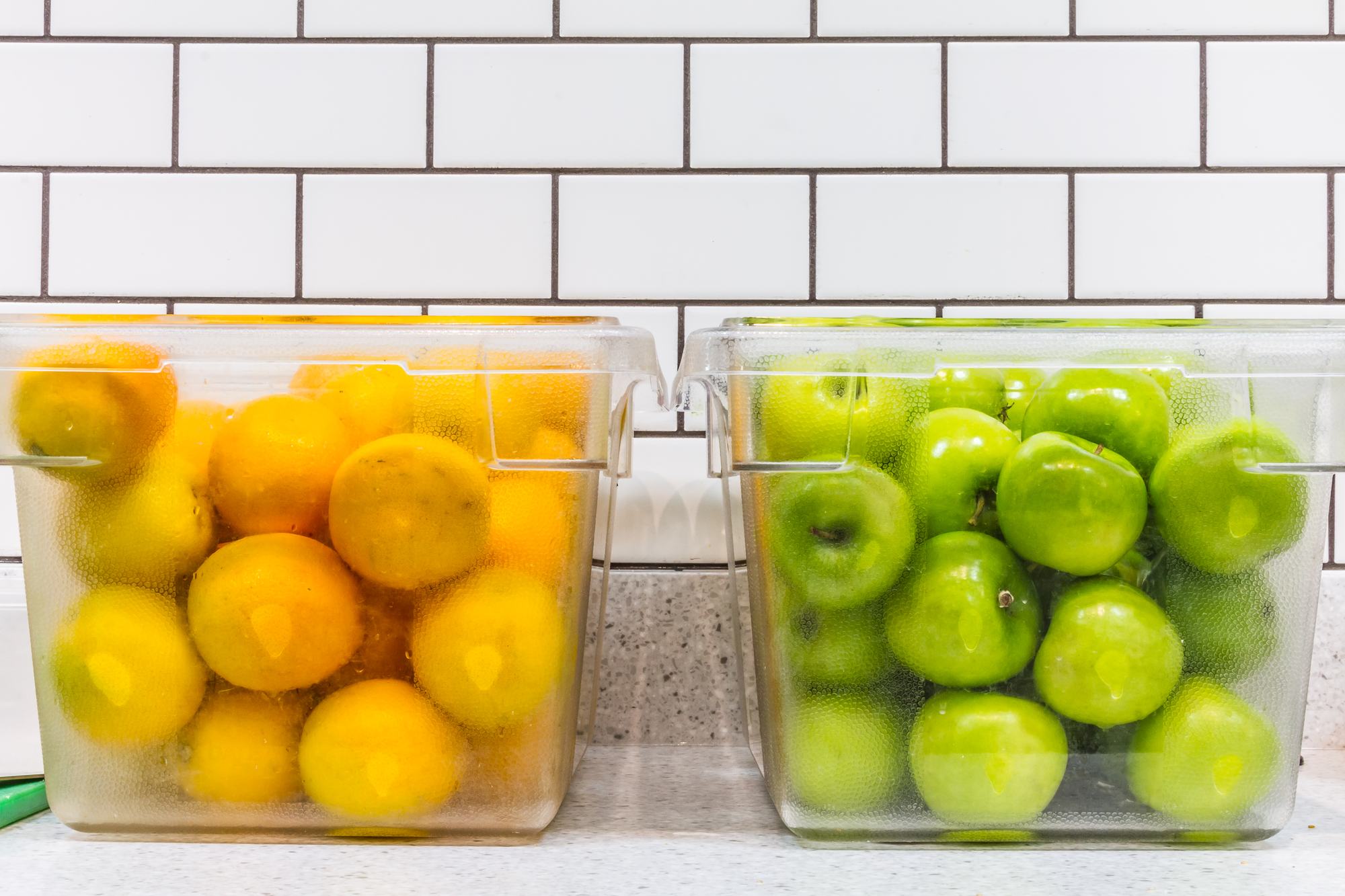
Sourced locally. Fruits and vegetables come in fresh.
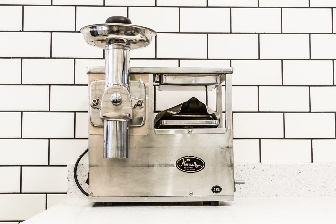
Ground. Produce is ground in-house.
Pressed. Slowly, with two tons of hydraulic pressure.
Delivered daily. Fresh batches go to all three locations.
Prepared by The Tribe Maker · mike@thetribemaker.com